Fibromyalgia Dataset Tutorial
Note: This dataset ds004144 is made up solely of female subjects.
First, open the Fibromyalgia dataset in ImageNomer as described in Getting Started with Docker. Alternatively, you can instead use the live on-line demo.
You should be able to see the following image:

FC View
Select “All” in the “Groups” area and click on the “FC” (functional connectivity) tab.
Additionally, check “ID” and “Task” under “Display Options”.
You should see the following:

Next, unselect “All” under “Groups” and select the first two subjects in the “Subjects” area.
You should see the following:

Phenotypes View
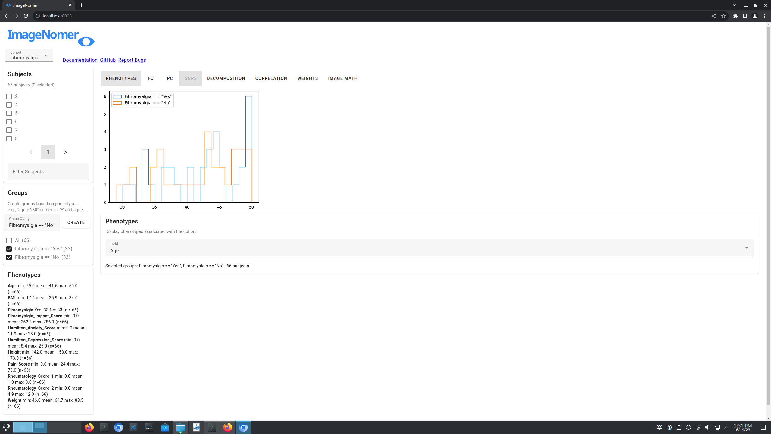
Select “All” in the “Groups” area and click on the “Phenotypes” tab.
Select “Age” as the “Field”.
You should see the following:

Now, we will create two groups, one for ‘Fibromyalgia == “Yes”’ and one for ‘Fibromyalgia == “No”’.
To create a group, type into the “Groups” area and click create. Python syntax is in use.
Select the groups you just created.
You should see the following:
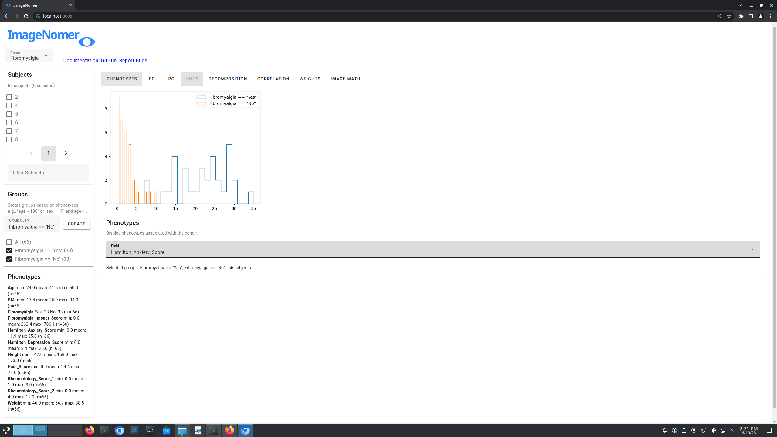
You can view some of the other fields in the “Phenotypes” tab, such as “Hamilton_Anxiety_Score”.
You should see the following:
Advanced Groups
You can also create groups based on continuous variables. Try creating the groups “Hamilton_Anxiety_Score < 5” and “Hamilton_Anxiety_Score >= 5”.
Then change the “Field” to “Pain_Score”.
You should see the following:

Summary Images
Go back to the “FC” tab, having selected the “Hamilton_Anxiety_Score < 5” and “Hamilton_Anxiety_Score >= 5” (selecting the “All” group would be equivalent).
Now, under the “Task” dropdown, select “rest”.
You should see the following:

Note that all images are of resting state FC.
Create a mean image by clicking “Mean”.
Navigate back to the “FC” tab. Do the same thing, except for “epr” under the “Task” dropdown.
You should see the following:


Image Math
In the “Image Math” tab, type in “A-B”, or whatever the labels are that correspond to your mean images.
Click “Go”.
You should see the group-wise difference between resting state and epr FC:

Phenotype Correlations
We can visualize correlations between phenotypes using the “Correlation” tab.
Navigate to the “Correlation” tab. Select “All” for “Group”, “Fibromyalgia” for “Demographic Feature”, “Yes” for “Category” (the dropdown should be created), and “BMI” for “Response Var”.
Click “Go”.
You should see the following:
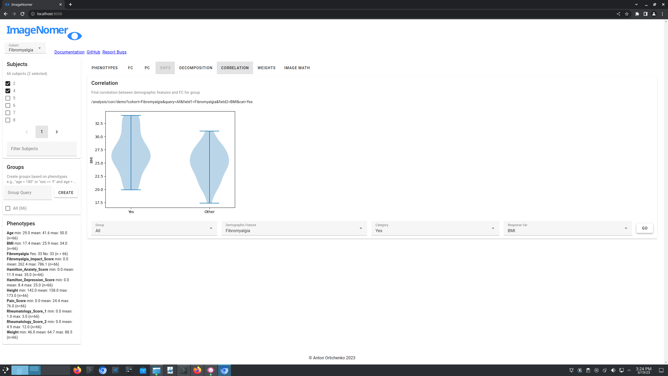
Note that there is a possibly statistically significant difference in BMI between the two groups. Not too large of a difference, but potentially interesting.
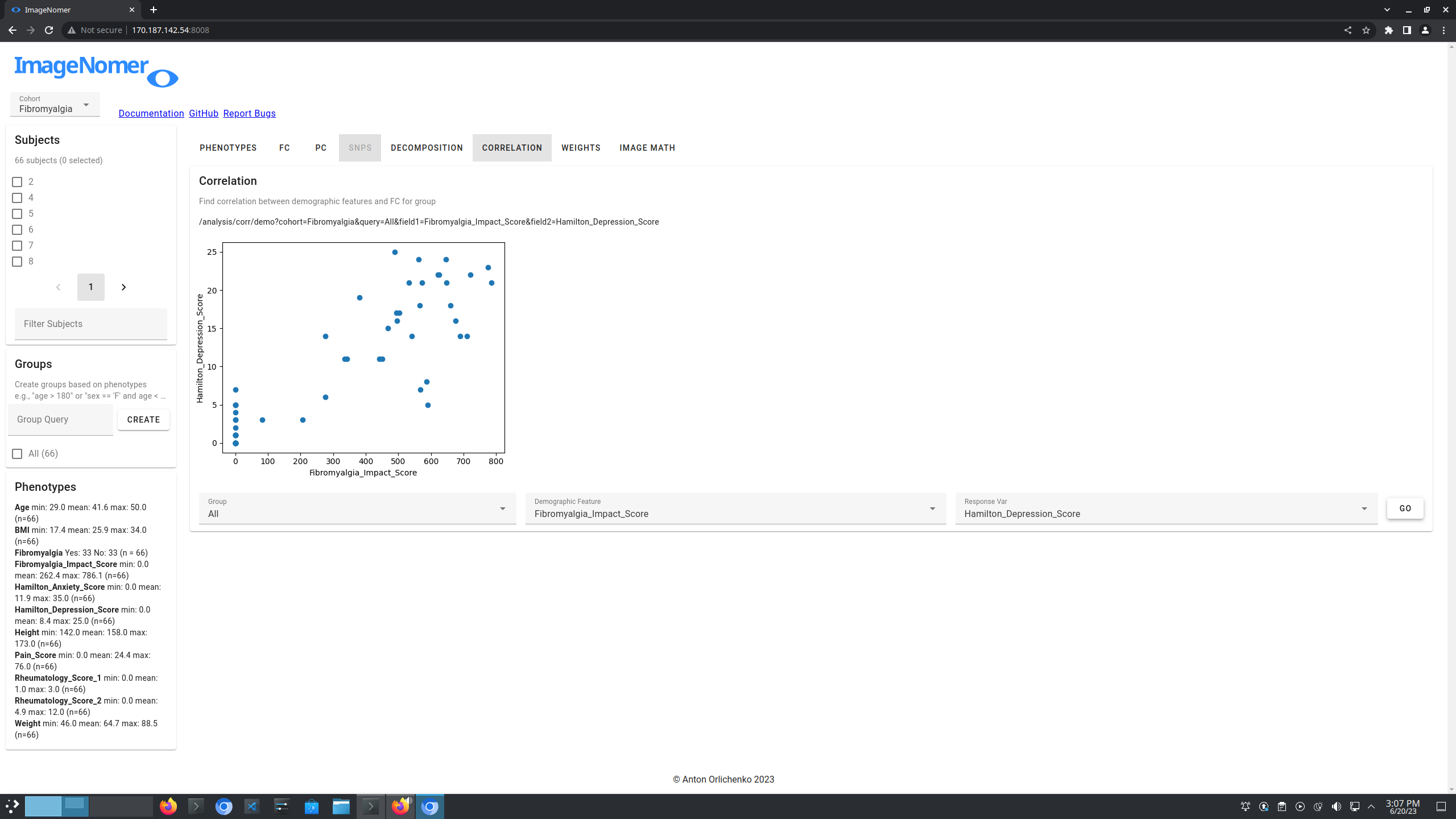
Likewise, try to correlate “Fibromalgia_Impact_Score” with “Hamilton_Depression_Score”.
You should see the following:
Phenotype-FC Correlations
Navigate to the “Correlation” tab. Select “All” for “Group”, “Rheumatology_Score_1” for “Demographic Feature”, “fc” for “Response Var”, and “All” for “Task” (the dropdown should be created).
Click “Go”.
You should see the following:

The left image displays the correlation between rheumatology score and each ROI-ROI FC. The right image displays the base-10 logarithm of the Bonferroni corrected p-values, clipped to log(p) == -5.
We see a particular band on regions in the DMN that is significantly different between the two groups.
Note that the p-values are overall weak here due to the small number of subjects, as well as due to the inherent variability of fMRI and FC.
Note also that since we are comparing 34,716 distinct ROI-ROI FC pairs (264x264 Power template matrix), the Bonferroni correction is very severe.
We can compare to the p-values from the PNC dataset:

Model Weights
We have performed simple machine learning on the fibromyalgia dataset and created weights files that can be visualized in ImageNomer.
More details on creation of these simple files coming soon, but the basics can be found by inspection of the final two cells of this notebook.
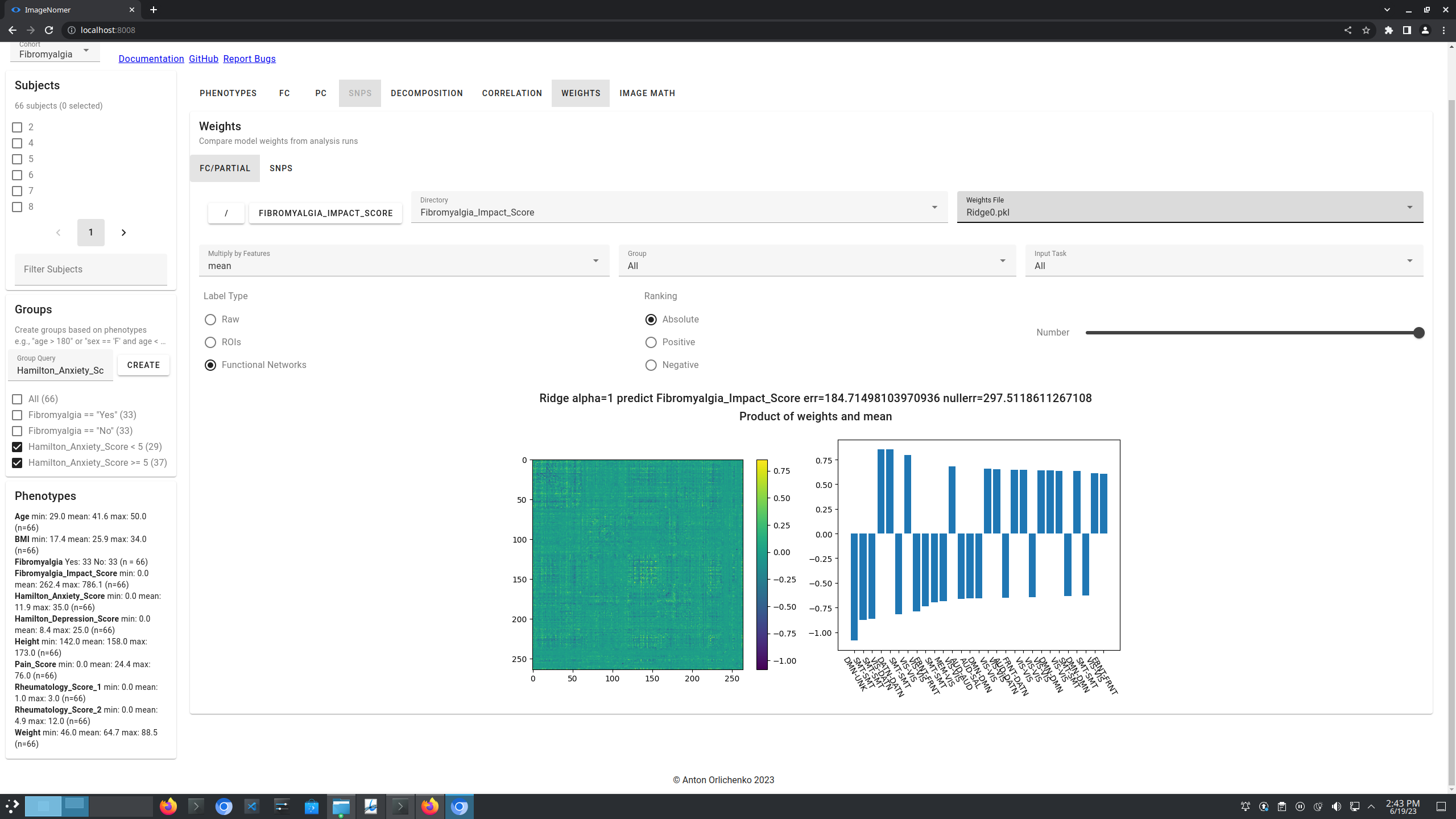
Navigate to the “Weights” tab.
Select “Fibromyalgia_Impact_Score” under the “Directory” dropdown. Select “Ridge0.pkl” under the “Weights File” dropdown.
Drag the “Number” slider all the way to the right.
Select “ROIs” as the “Label Type”.
You should see the following:

Next, select “mean” under the “Multiply By Features” dropdown.
You should see the following:
Next, select “Lasso0.pkl” under the “Weights File” dropdown.
You should see the following:

Note the sparsity of Lasso compared to Ridge. These model estimations were performed on 80% training, 20% test splits, so there is a lot of variability in the individual runs.
Also note that, in these analyses, we may place the rest and epr scans of a single subject into the training and test sets, respectively (or vice versa). Previous studies have shown that fMRI has a large amount of identifiability (see Finn et al. 2015), and it is likely that some memorization of individual subjects is occuring.
In case you are curious, logistic regression yields about a 75% accuracy on the test set (with the additional caveat of memorization).
Partial Correlation
All tasks that are available for FC are available for partial correlation under the “PC” tab. Partial correlation is less interesting for this dataset.
Click on the “PC” tab.
You should see something like the following:

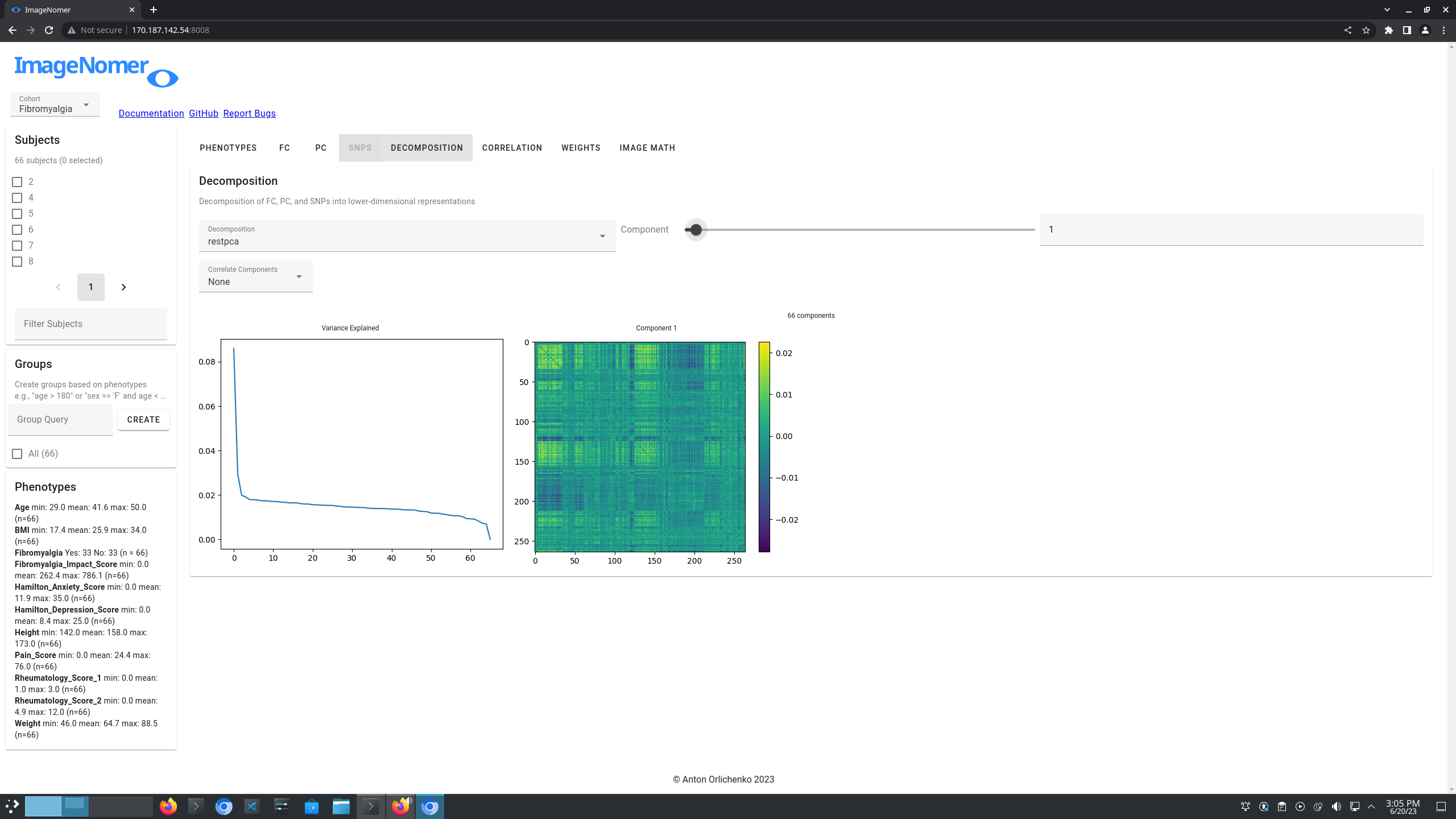
Decomposition
We have created PCA decompositions of resting state and epr FC using the procedure in this notebook.
Let’s take a look at them in ImageNomer.
Click on the “Decomposition” tab.
Select “restpca” under the “Decomposition” dropdown.
Use the slider to select the zeroth component.
You should see the following:

Use the component slider or input box to the right to change to component 1.
You should see the following:
Click on the “Correlate Components” dropdown and select “pheno”.
Select “Rheumatology_Score_1” under the “Phenotype” dropdown.
Move the “To Component” slider all the way to the right.
Click “Correlate Pheno”.
You should see the following:

Scroll the “To Component” slider to select 8 components.
Scroll the “Component” slider to select component 4.
Click “Correlate Pheno”.
You should see the following:
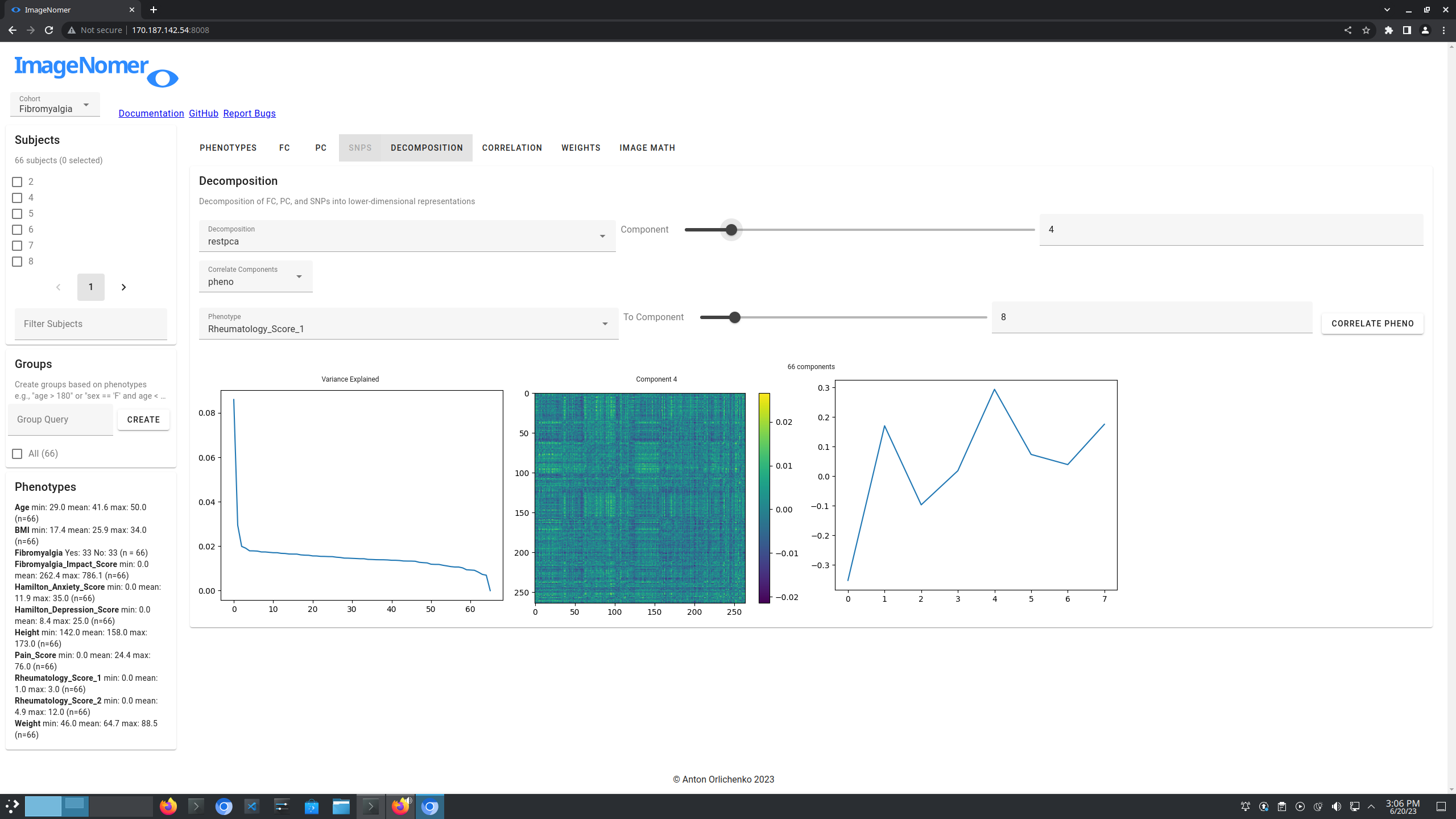
We see that component 0 is the most negatively correlated with Rheumatology_Score_1 and component 4 is the most postively correlated, among the PCA decomposition of resting state FC.
For reference, a maximum absolute value of correlation from 0.35 to 0.4 is approximately what is seen in the PNC dataset when correlating FC with age, although that dataset contains many more subjects.
Age prediction is the easiest task in the PNC dataset, with almost 100% ability to distinguish between the FC of very young children and the FC of young adults (see Hu et al. 2019).
SNPs
Coming soon.
Further Analysis
Another interesting analysis can be done by taking mean FC images of the ‘Fibromyalgia == “Yes”’ and ‘Fibromyalgia == “No”’ groups, and subtracting them in the “Image Math” tab.
This is left for the user to try out.
Report Bugs
Please send questions or bug reports to my email.